Back to Knowledge
Aquarius & Taurus UI Designer: Soulmate or Workplace Enemy?
 Zodiac Assistant
2026-05-26
About 3 min read
Zodiac Assistant
2026-05-26
About 3 min read
Aquarius and Taurus UI Designers: Soulmates or Workplace Foes? A Deep Dive into Zodiac Compatibility
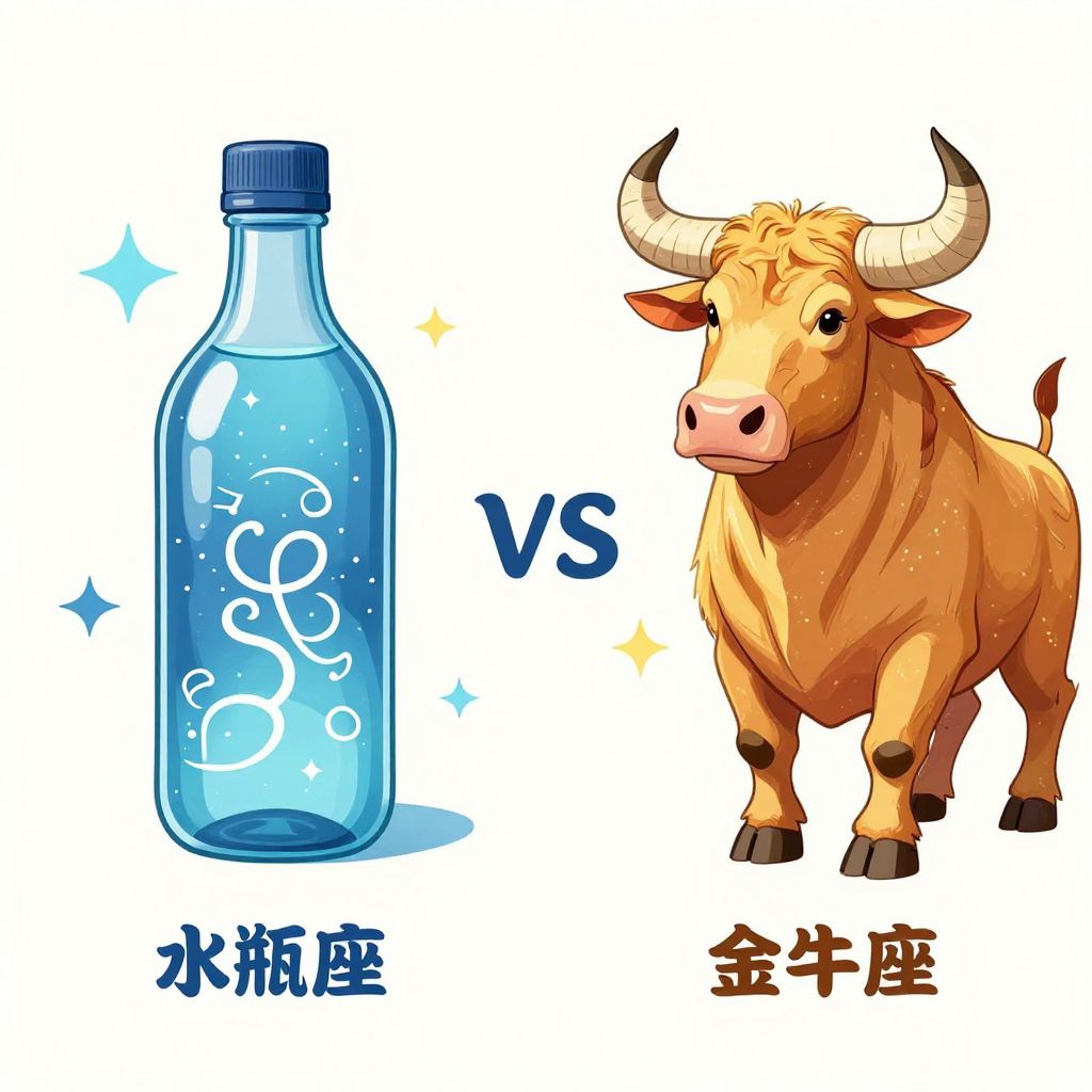 In the cutthroat world of UI design, the “wild imagination” of Aquarius and the “meticulous attention to detail” of Taurus often engage in a fascinating power struggle. When these two vastly different signs sit before the same Adobe Creative Suite, will they spark industry-shattering inspiration, or will they completely fall apart due to changing requirements and aesthetic disagreements? Today, we break down this high-stakes, high-reward workplace pairing.
The “Rebellious Spirit” of Aquarius and the “Steady as a Rock” Taurus
Aquarius UI designers are often the “wild card” in the team. They despise being bound by rules and excel at thinking outside the box, creating interaction logic that is eye-catching but may leave users baffled. For them, design is about expression and innovation; interfaces need personality, and even a touch of rebellion.
In contrast, Taurus is the “rock” of the team. They pursue ultimate stability and perfection, showing a near-paranoid commitment to pixel-perfect alignment and strict adherence to color specifications. Taurus designers believe that good design isn’t about showing off—it’s about ensuring users find the product intuitive and reassuring. In their eyes, guidelines are law, and details determine success.
When Inspiration Meets Regulation: Conflict and Adjustment
At first glance, these two seem like natural enemies. Aquarius sees Taurus as “stuffy,” “uncreative,” and “too conservative,” while Taurus complains that Aquarius is “flighty,” “ungrounded,” and exhausting due to constant revisions. During UI review meetings, Aquarius might want to add a flashy dynamic effect, while Taurus calmly points out the high development costs and negative impact on loading speeds. Aquarius may propose a avant-garde minimalist layout, but Taurus insists on clear functional guidance to ensure conversion rates.
How to Turn “Foes” into “Allies”?
In fact, if properly aligned, this combination can become a highly competitive “golden pair.” Aquarius’s innovation brings differentiated competitiveness to the product, while Taurus’s rigor ensures the stability of the product’s implementation and the smoothness of the user experience.
The key lies in “translation” and compromise. Aquarius needs to learn to package their creativity with data and user scenarios, allowing Taurus to see the logic behind the innovation. Taurus, on the other hand, needs to try accepting unconventional design languages, using an inclusive mindset to understand Aquarius’s artistic pursuits.
Overall, Aquarius and Taurus are not irreconcilable in the field of UI design. Rather than soulmates, they are complementary comrades. In an industry that values both experience and efficiency, the ultimate secret to creating a blockbuster product lies in combining unconstrained imagination with grounded execution.


 Related Articles